create intuitive and interactive dashboards and charts In React Application.


Want to create intuitive and interactive dashboards and charts?
Overview
The @mui/x-charts is an MIT library for rendering charts relying on D3.js for data manipulation and SVG for rendering. And, like other MUI X components, charts are production-ready components that integrate smoothly into your app.
With a high level of customization, MUI X Charts provides three levels of customization layers: single components with great defaults, extensive configuration props, and subcomponents for flexible composition. Additionally, you can also use all the MUI System tools, such as the theme override or the sx prop.
JSTS
Collapse code
import * as React from 'react';
import { BarChart } from '@mui/x-charts/BarChart';

export default function ChartsOverviewDemo() {
  return (
    <BarChart
      series={[
        { data: [35, 44, 24, 34] },
        { data: [51, 6, 49, 30] },
        { data: [15, 25, 30, 50] },
        { data: [60, 50, 15, 25] },
      ]}
      height={290}
      xAxis={[{ data: ['Q1', 'Q2', 'Q3', 'Q4'], scaleType: 'band' }]}
      margin={{ top: 10, bottom: 30, left: 40, right: 10 }}
    />
  );
}
Press Enter to start editing
Using the documentation
The MUI X Charts documentation has a slightly different structure than other MUI X components. Instead of having a long page for each, the pages are divided in two:
General description of the built-in features the component provides.
A set of examples demonstrating the component with customizations.
All MUI X Charts components

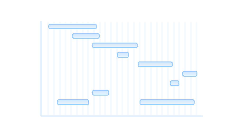
Bar Chart
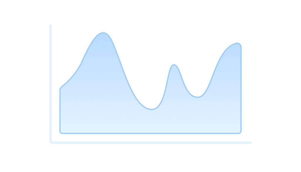
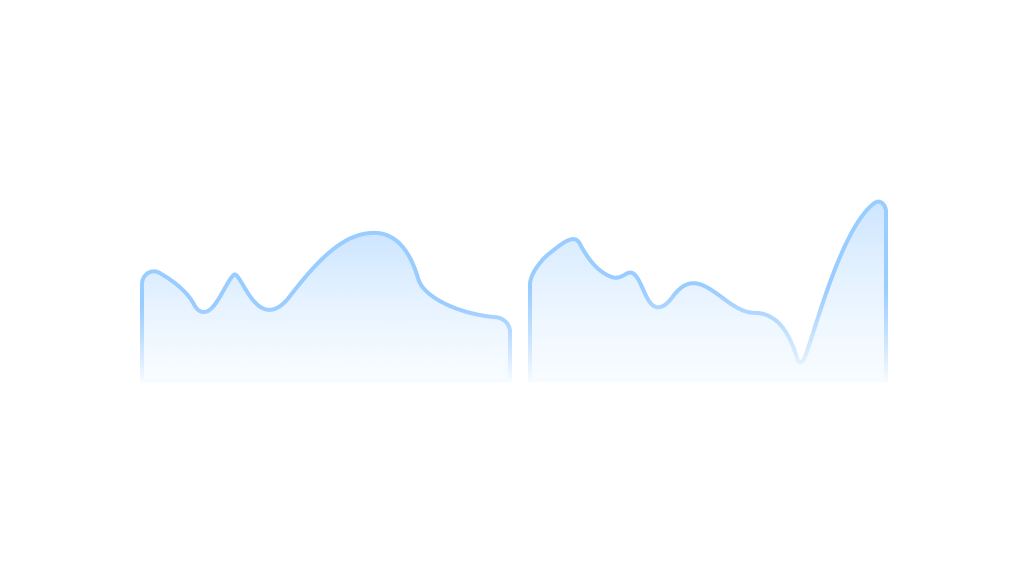
Line Chart
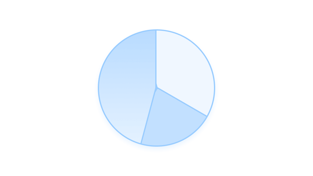
Pie Chart
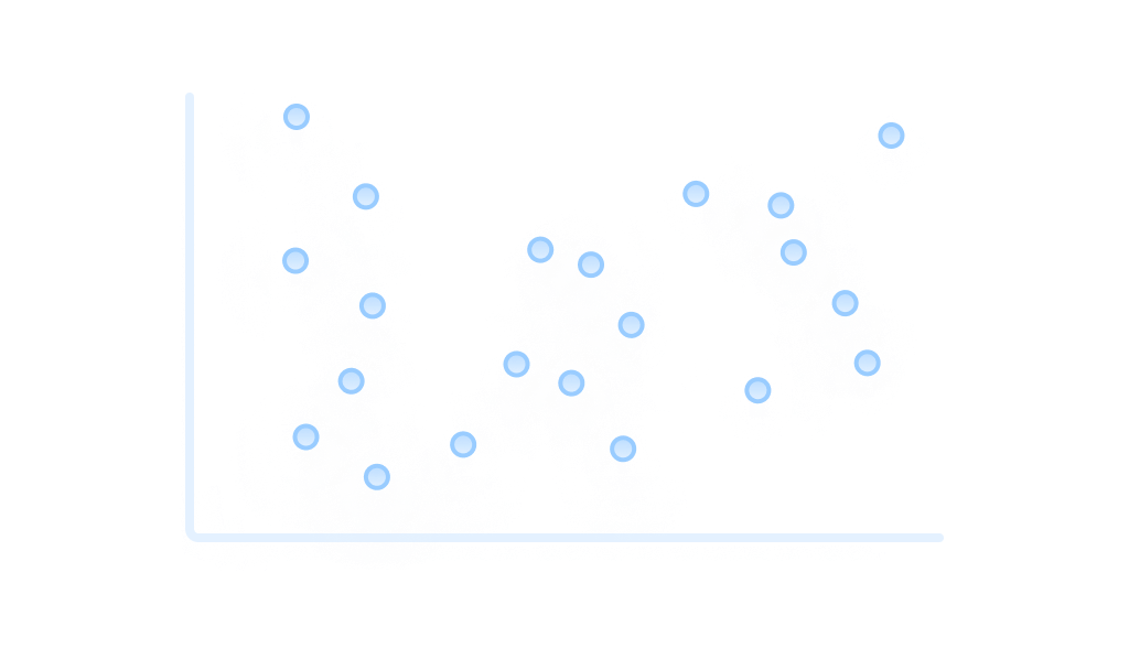
Scatter Chart
Sparkline

Gauge

Radar Chart
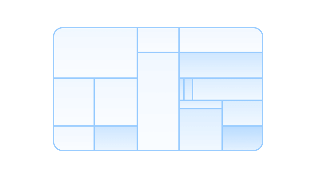
Treemap

Heatmap
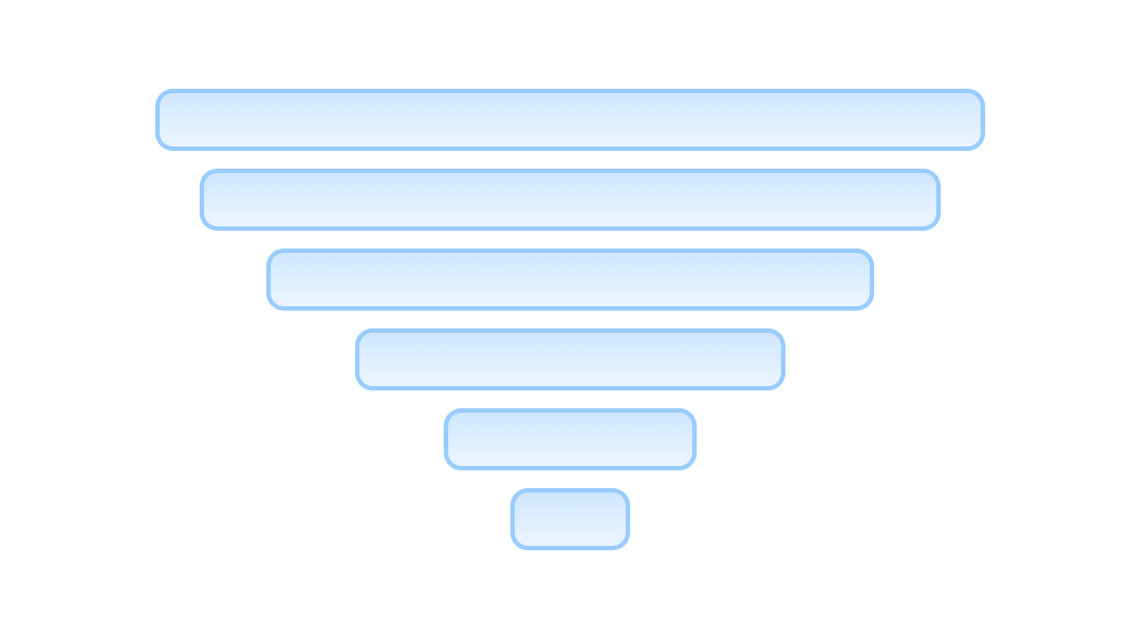
Funnel Chart

Sankey Chart